ShopDreamUp AI ArtDreamUp

Deviation Actions
Gratuity Treasure Chest
Joining this tier, you gain access to a reserved extra content that are carefully crafted just for you.
Your subscription doesn't just support my art; it fuels it, allowing me to dedicate more time and resources to producing even more of the content you love. It's a partnership that propels this project forward.
Join me in this exclusive tier, and together, let's take this artistic adventure to new heights. Your appreciation fuels my passion.
$2/month


Suggested Deviants


Suggested Collections


You Might Like…


Featured in Groups


Description
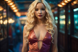
This is a tanka/elegy poem with an edited image.
Awesome stock from: [link]
This is the second tanka that I have posted (a Japanese form of poetry with a 5,7,5,7,7 syllable stucture) and including everything it took around 4.5 hours to complete.
Hope you guys like it
")
P.S. please do not copy or redstribute my work without my permission-thanks!
Awesome stock from: [link]
This is the second tanka that I have posted (a Japanese form of poetry with a 5,7,5,7,7 syllable stucture) and including everything it took around 4.5 hours to complete.
Hope you guys like it
P.S. please do not copy or redstribute my work without my permission-thanks!
Image size
730x1095px 473.85 KB
Comments54
Join the community to add your comment. Already a deviant? Log In
Hi, Sean here with a requested critique from 
I tend to be scared of commenting on poetry turned into art like this, because very often the person is looking for praise, not critique. But if you are open to change, I have none for the words themselves, just the placement.
The picture is beautiful and the words great, so I'd suggest you move them down a bit and use a color that will stand out better. Right now "Snatched before" blends into the green above it, "the reaper's claim" goes into the dark area of her neck, the comma after "legacy" disappears, and "woe" crashes a bit too.
All else looks great.